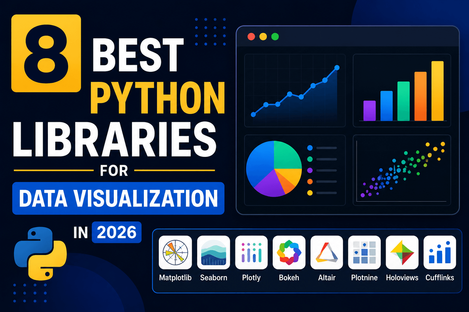
8 Best Python Libraries for Data Visualization in 2026
Seaborn is the best Python data visualization library for most data analysis work. It sits on top of Matplotlib, works naturally with pandas DataFrames, and creates clean statistical charts with much less code than raw Matplotlib.
Matplotlib is still the foundation. Use it when you need precise control, publication-ready static figures, or compatibility with scientific Python tools. Plotly is the best choice when the chart needs hover tooltips, zooming, sharing, or dashboard use. Altair is best when you like declarative chart grammar and want concise, readable chart code.
The best library depends on what you are building. Notebook exploration is different from a PDF report. A dashboard is different from a paper figure. A 500-row CSV is different from a 5-million-row time series.
Use Seaborn for everyday analysis. Use Matplotlib when control matters. Use Plotly for interactive charts. Use Altair for clean declarative charts. Use Bokeh or hvPlot when you are building browser-based tools or working with larger interactive datasets.
Quick Verdict
1. Seaborn (Best Default for Data Analysis)
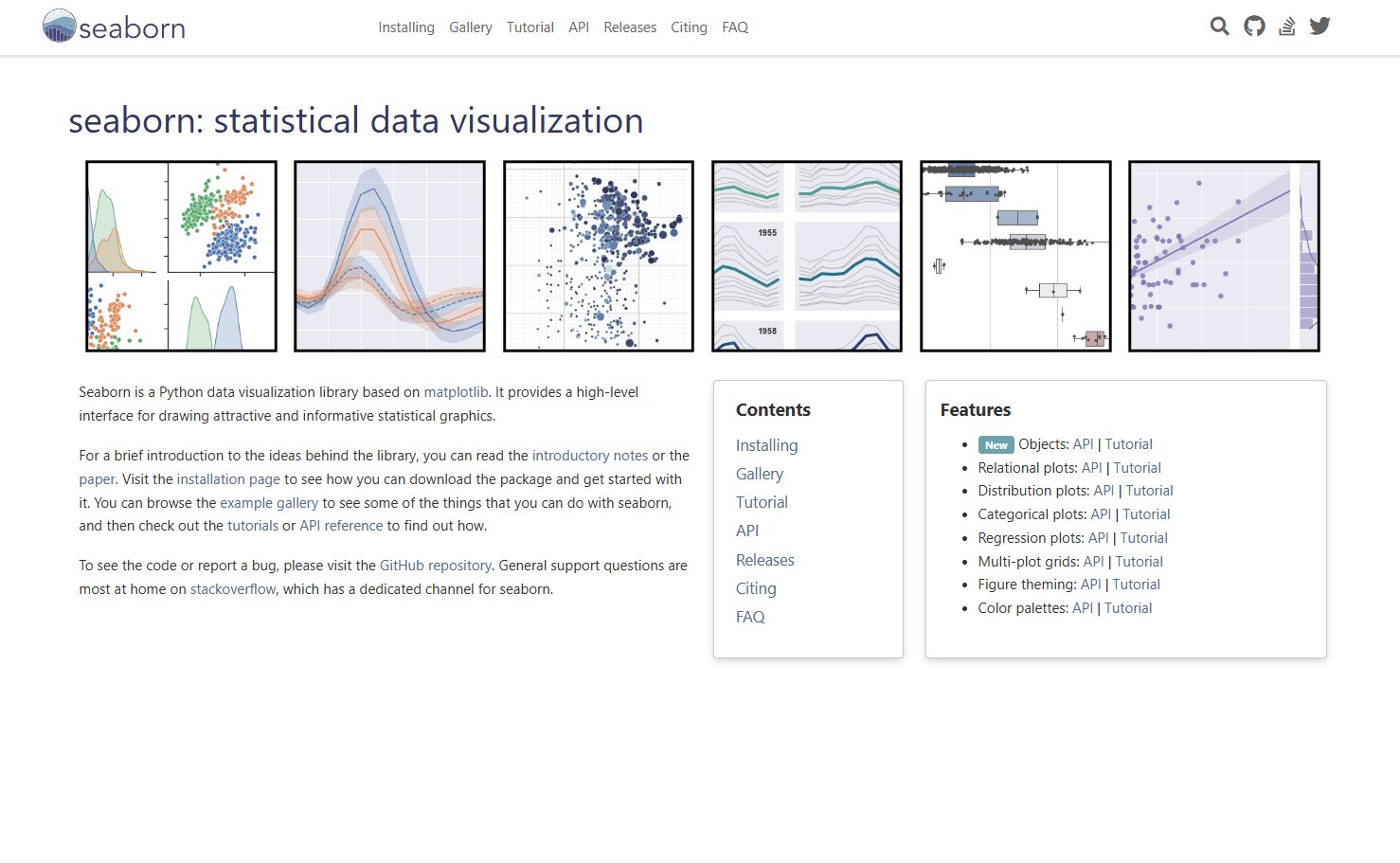
Seaborn is the best first choice for analysts, data scientists, and Python users who want good-looking statistical charts without spending all afternoon styling axes.
It is built on Matplotlib and provides a higher-level interface for statistical graphics. That means you still get Matplotlib compatibility, but the code is cleaner for common analysis tasks.
What you get:
- Clean default styles
- Excellent pandas DataFrame support
- Statistical plots like box plots, violin plots, regression plots, histograms, and KDE plots
- Faceting with col and row arguments
- Good color palettes
- Less boilerplate than Matplotlib
What you don't get:
- Native browser-style interactivity
- Complete low-level control without dropping into Matplotlib
- The fastest workflow for large web dashboards
Basic example:
import seaborn as sns
import matplotlib.pyplot as plt

tips = sns.load_dataset("tips")

sns.scatterplot(
    data=tips,
    x="total_bill",
    y="tip",
    hue="time",
    size="size"
)

plt.show()
Seaborn shines when your data already lives in a DataFrame and you want to understand relationships quickly. Scatter plots, distribution plots, categorical comparisons, and regression lines all feel natural.
When this is best:
Use Seaborn when you are doing exploratory data analysis in Jupyter, comparing groups, checking distributions, or preparing readable charts for internal reports. If you are not sure which Python visualization library to start with, start here.
2. Matplotlib (Best Foundation and Full Control)
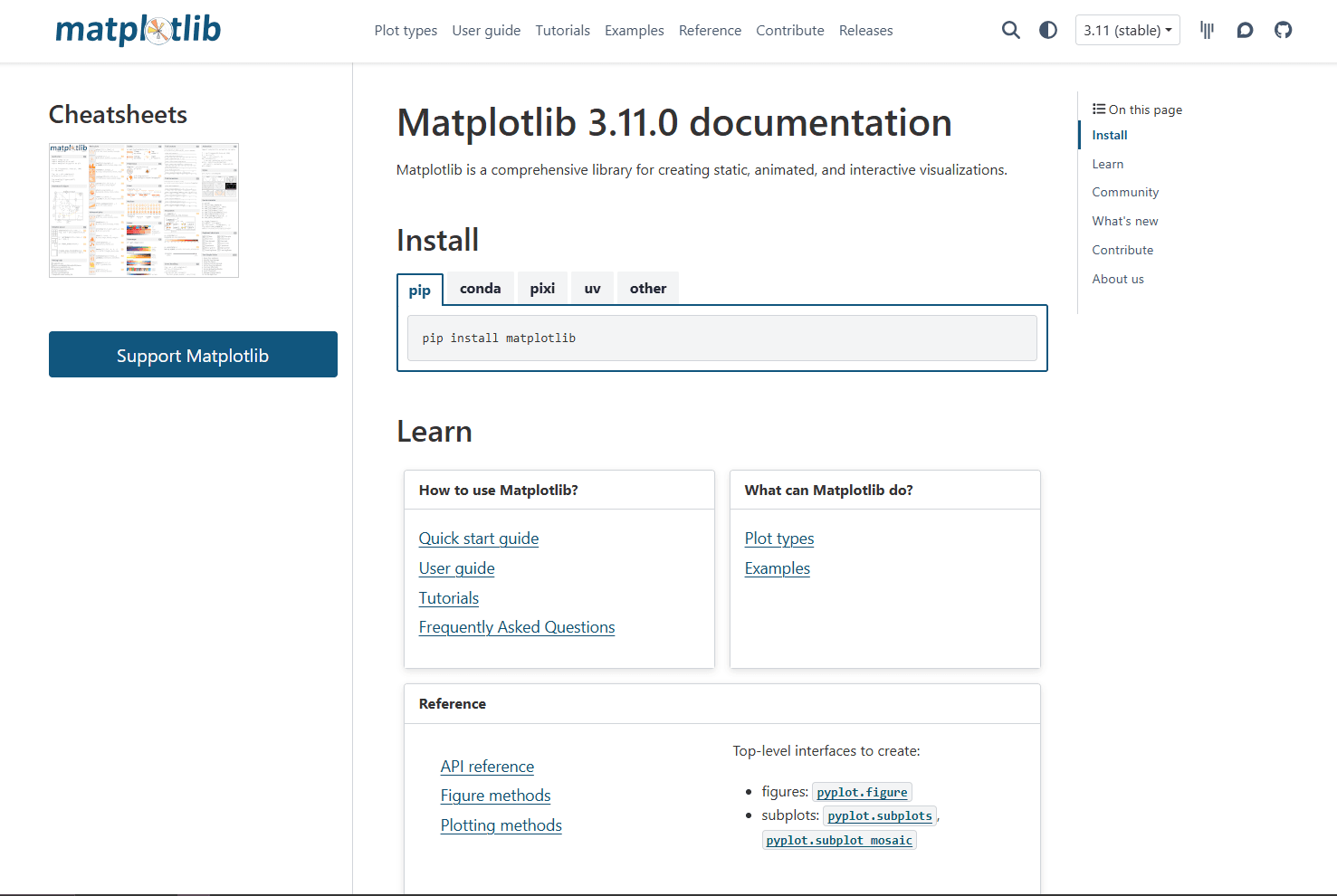
Matplotlib is the core plotting library behind much of the Python visualization ecosystem. It creates static, animated, and interactive visualizations, and many other libraries either build on it or integrate with it.
Matplotlib is not always the shortest path to a pretty chart, but it is the most dependable path when you need exact control.
What you get:
- Fine control over every part of a figure
- Publication-quality static output
- PNG, SVG, PDF, EPS, and other export formats
- Strong compatibility with NumPy, pandas, SciPy, and Jupyter
- Object-oriented API for serious figure layout
- Huge ecosystem and years of examples
What you don't get:
- Modern-looking defaults without styling
- Concise code for complex statistical charts
- Easy web interactivity out of the box
Basic example:
import matplotlib.pyplot as plt

months = ["Jan", "Feb", "Mar", "Apr"]
revenue = [12000, 15000, 13000, 18000]

fig, ax = plt.subplots()
ax.plot(months, revenue, marker="o")
ax.set_title("Monthly Revenue")
ax.set_xlabel("Month")
ax.set_ylabel("Revenue ($)")

plt.show()
Matplotlib is the tool you reach for when the chart needs to be exactly right. Custom subplot layouts, annotations, axis formatting, color control, and export settings are all deeply supported.
When this is best:
Use Matplotlib for academic papers, scientific plots, static reports, custom dashboards where another library renders the final image, or any situation where pixel-level control matters more than speed.
3. Plotly (Best for Interactive Charts)
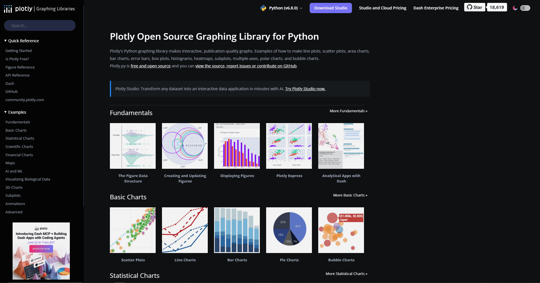
Plotly Python is the best choice when users need to interact with the chart. Hover labels, zooming, panning, legend toggles, sliders, dropdowns, and browser-based sharing are built into the workflow.
Plotly Express makes common charts quick. Graph Objects gives you more control when the chart becomes complex.
What you get:
- Interactive charts with hover and zoom
- Easy HTML export
- Good-looking defaults
- Strong support for maps, 3D charts, financial charts, and dashboards
- Natural path into Dash apps
- Works well in notebooks
What you don't get:
- Lightweight static images by default
- The same low-level print control as Matplotlib
- Small HTML files for very large charts
Basic example:
import plotly.express as px

df = px.data.gapminder().query("year == 2007")

fig = px.scatter(
    df,
    x="gdpPercap",
    y="lifeExp",
    size="pop",
    color="continent",
    hover_name="country",
    log_x=True
)

fig.show()
Plotly is especially strong when a static image would hide too much detail. Hovering over points, zooming into outliers, or filtering traces from the legend can make exploration much easier.
When this is best:
Use Plotly for dashboards, stakeholder-facing notebooks, interactive reports, web apps, maps, 3D visualizations, and charts where the reader needs to inspect individual data points.
4. Altair (Best Declarative Chart Grammar)
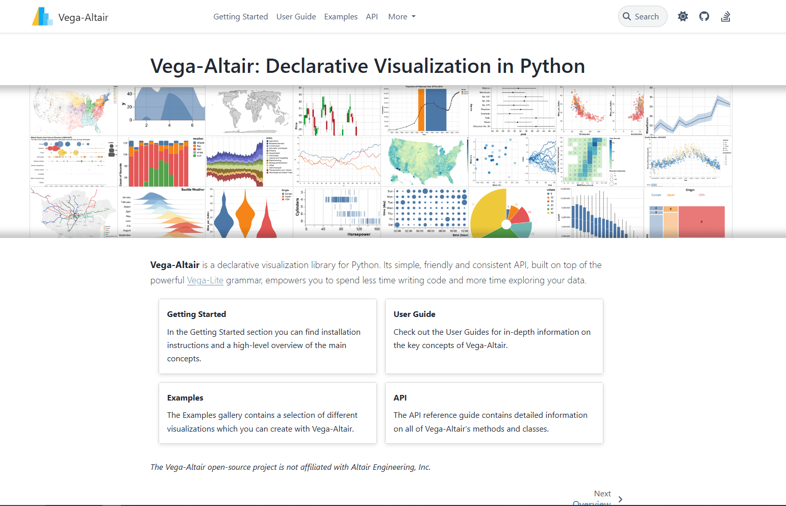
Vega-Altair is a declarative visualization library for Python. Instead of manually controlling every drawing step, you describe the mapping between data fields and visual encodings.
That makes Altair code unusually readable.
What you get:
- Clean declarative syntax
- Strong mental model based on encodings
- Excellent integration with pandas
- Interactive selections and filtering
- Charts backed by Vega-Lite
- Easy faceting, layering, and composition
What you don't get:
- The same universal familiarity as Matplotlib
- Ideal performance with large raw datasets unless you manage data size
- As much low-level escape-hatch control as Matplotlib
Basic example:
import altair as alt
import pandas as pd

df = pd.DataFrame({
    "month": ["Jan", "Feb", "Mar", "Apr"],
    "sales": [120, 150, 130, 180],
    "region": ["East", "East", "West", "West"]
})

chart = alt.Chart(df).mark_bar().encode(
    x="month",
    y="sales",
    color="region"
)

chart
Altair feels good when you think in terms of questions: which field goes on the x-axis, which field controls color, which aggregation should run, and which selection should filter the view.
When this is best:
Use Altair for notebook exploration, teaching, compact chart code, layered visualizations, and teams that prefer readable chart specifications over manual plotting instructions.
5. Bokeh (Best for Browser-Based Visualization Apps)
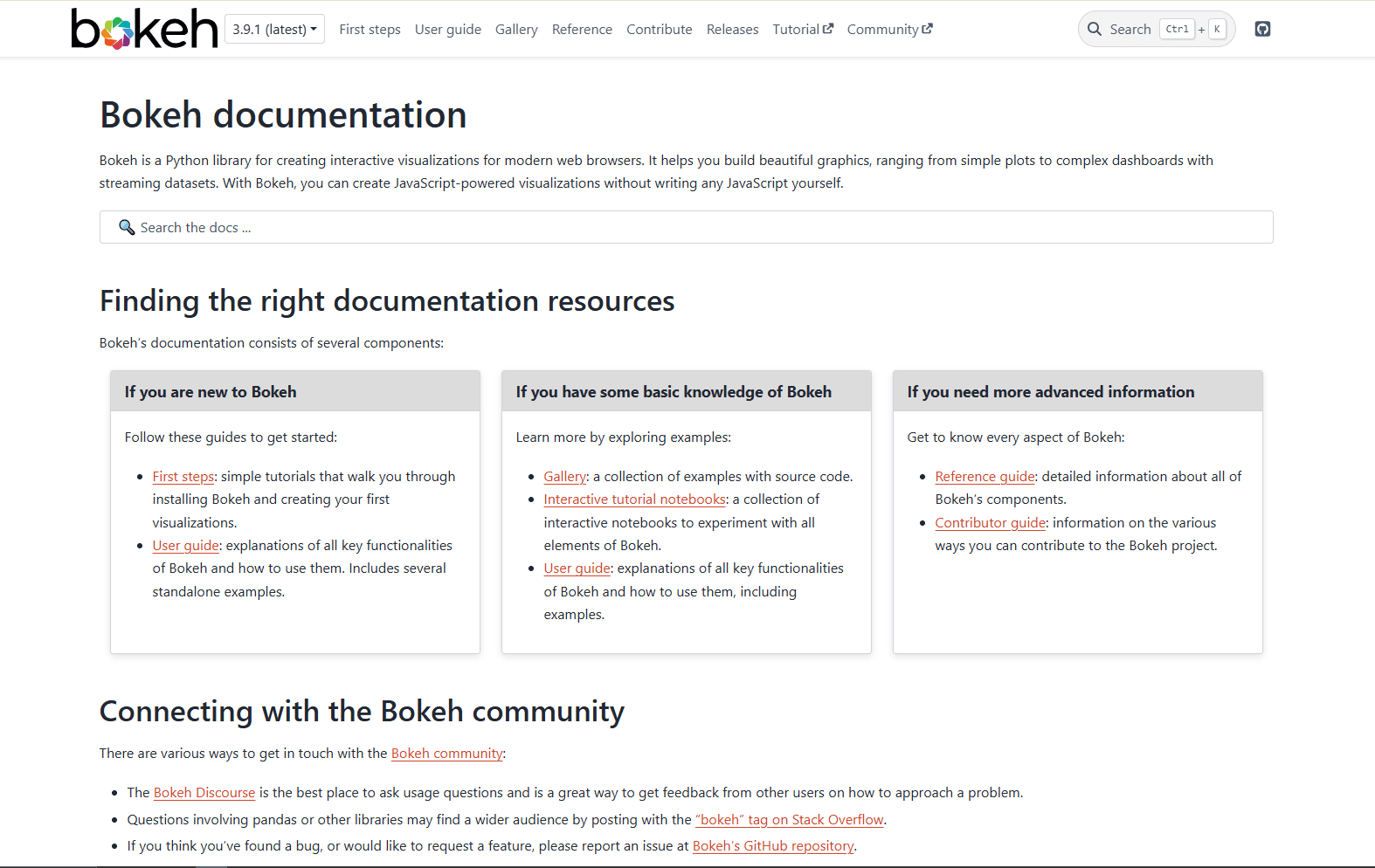
Bokeh creates interactive visualizations for modern web browsers using Python. It is useful when you want JavaScript-powered charts without writing JavaScript yourself.
Plotly is usually faster for one-off interactive charts. Bokeh becomes more interesting when you need custom browser behavior, streaming data, linked plots, or app-like interactions.
What you get:
- Interactive browser charts
- Linked brushing and selections
- Streaming data support
- Custom widgets and layouts
- Server-backed interactive apps
- Good control over browser-rendered plots
What you don't get:
- The fastest beginner path compared with Plotly Express
- The same statistical chart shortcuts as Seaborn
- The same print-first workflow as Matplotlib
Basic example:
from bokeh.plotting import figure, show

p = figure(title="Monthly Revenue", x_axis_label="Month", y_axis_label="Revenue")
p.line([1, 2, 3, 4], [12000, 15000, 13000, 18000], line_width=2)
p.circle([1, 2, 3, 4], [12000, 15000, 13000, 18000], size=8)

show(p)
Bokeh is not just a chart library. It can become the front end for an internal data tool when you need sliders, filters, callbacks, and live updates.
When this is best:
Use Bokeh for custom interactive tools, browser-based dashboards, streaming metrics, linked plots, and data applications where Plotly's defaults feel too boxed in.
6. pandas Plotting (Best for Quick DataFrame Checks)
pandas plotting is not a separate visualization library, but it is often the first plotting interface people use in Python.
It is perfect for quick checks while cleaning data.
What you get:
- Built into pandas workflows
- Fast line, bar, histogram, box, area, scatter, and pie charts
- Minimal code
- Uses Matplotlib by default
- Good enough for quick sanity checks
What you don't get:
- Beautiful defaults compared with Seaborn
- Rich interactivity
- Advanced statistical chart design
- Deep customization without using Matplotlib directly
Basic example:
import pandas as pd

df = pd.DataFrame({
    "month": ["Jan", "Feb", "Mar", "Apr"],
    "revenue": [12000, 15000, 13000, 18000]
})

df.plot(x="month", y="revenue", kind="line")
The point is speed. If you just loaded a CSV and want to know whether a column trends upward, df.plot() is enough. If the chart needs to be shared, move to Seaborn, Matplotlib, Plotly, or Altair.
If your source data starts as JSON, convert or flatten it first. For spreadsheet workflows, the JSON to Excel converter can help turn nested JSON into table-shaped data before visualization.
When this is best:
Use pandas plotting during data cleaning, notebook exploration, quick QA checks, and early analysis before you know which chart deserves polish.
7. Plotnine (Best ggplot2-Style Library for Python)
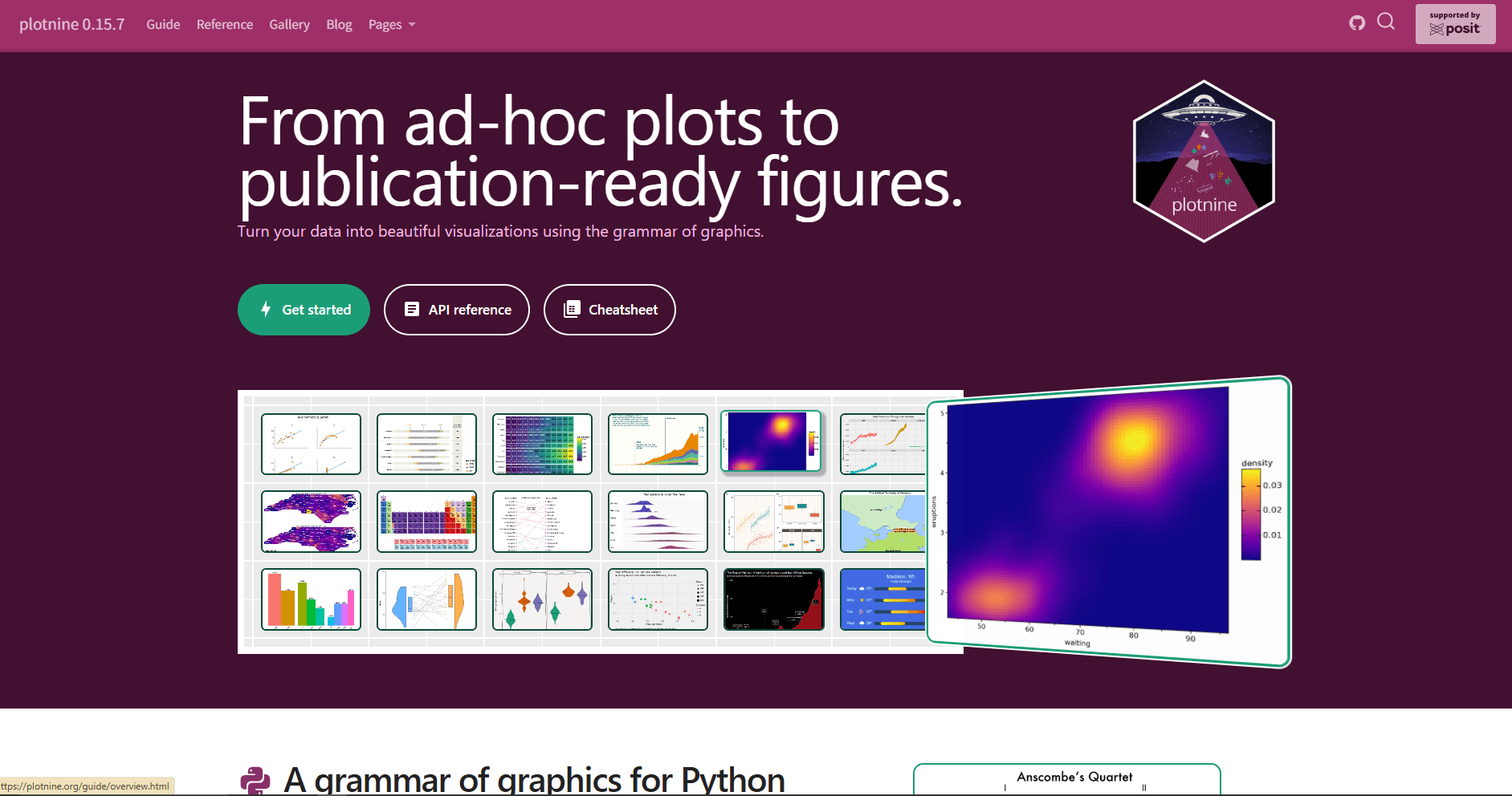
Plotnine brings a grammar-of-graphics style API to Python. If you come from R and like ggplot2, Plotnine will feel familiar.
Instead of calling a different function for every chart type, you build charts by combining data, aesthetics, geoms, scales, facets, and themes.
What you get:
- Grammar of graphics in Python
- ggplot2-like syntax
- Layered chart construction
- Faceting and theming
- Great mental model for analytical plots
What you don't get:
- The same adoption level as Matplotlib or Seaborn
- Native browser interactivity
- The easiest path for beginners unfamiliar with ggplot2
Basic example:
from plotnine import ggplot, aes, geom_point, facet_wrap
from plotnine.data import mpg

(
    ggplot(mpg, aes(x="displ", y="hwy", color="class"))
    + geom_point()
    + facet_wrap("class")
)
Plotnine is especially nice when you want chart logic to read like a specification. Data goes here. X and y go here. Add points. Split into panels. Apply a theme.
When this is best:
Use Plotnine if you already know ggplot2, teach visualization concepts with grammar-of-graphics language, or want layered static charts without writing raw Matplotlib code.
8. hvPlot (Best for Interactive pandas and xarray Workflows)
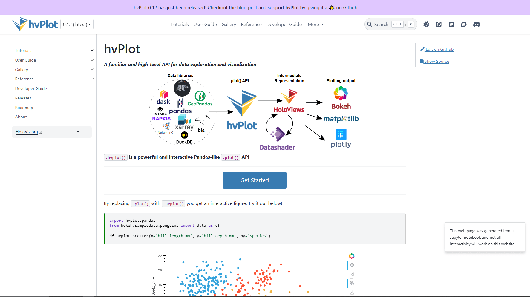
hvPlot gives pandas, xarray, Polars, Dask, and other data objects a high-level plotting API. It is part of the HoloViz ecosystem and can render through backends like Bokeh, Matplotlib, or Plotly.
The appeal is simple: keep working with your data object and call .hvplot.
What you get:
- Concise plotting from pandas-like objects
- Interactive defaults with Bokeh
- Support for larger and multidimensional data workflows
- Good fit for time series, geospatial, gridded, and xarray data
- Path into Panel dashboards
What you don't get:
- As much standalone mindshare as Matplotlib, Seaborn, or Plotly
- Best experience outside the HoloViz ecosystem
- The simplest setup for a basic bar chart
Basic example:
import pandas as pd
import hvplot.pandas

df = pd.DataFrame({
    "month": ["Jan", "Feb", "Mar", "Apr"],
    "revenue": [12000, 15000, 13000, 18000]
})

df.hvplot.line(x="month", y="revenue")
hvPlot is useful when pandas plotting feels too basic but writing full Bokeh code feels like too much. It gives you a short path to interactive charts while keeping your DataFrame-centered workflow.
When this is best:
Use hvPlot for interactive notebooks, larger time series, xarray datasets, Panel dashboards, and workflows where you want a simple plotting call but richer output than df.plot().
Which Python Visualization Library Should You Actually Use?
Most teams should not pick one library forever. Use a small stack.
For everyday data analysis:
Use Seaborn plus Matplotlib. Seaborn handles the common statistical charts. Matplotlib handles final tweaks, annotations, export, and layout.
For interactive notebooks:
Use Plotly or Altair. Plotly is better when you want hover-rich charts with lots of chart types. Altair is better when you want concise declarative chart code.
For dashboards:
Use Plotly with Dash if you want the most common Python dashboard path. Use Bokeh or hvPlot with Panel if you want more HoloViz-style control and interactive data apps.
For quick checks:
Use pandas plotting. It is not the prettiest, but it is fast and already available when you are cleaning data.
For R users moving to Python:
Use Plotnine. The grammar-of-graphics model will feel familiar, and the code will be easier to reason about than Matplotlib if you already think in ggplot layers.
Matplotlib vs Seaborn vs Plotly
These three libraries cover most Python visualization needs.
Seaborn and Matplotlib are not enemies. Seaborn uses Matplotlib underneath, so a common workflow is to create the chart with Seaborn and then adjust labels, legends, layout, or annotations with Matplotlib.
Plotly is different because the output is interactive and web-oriented. That is powerful, but not always needed. A simple static box plot in a PDF report does not need a full interactive chart bundle.
Best Library by Use Case
Common Mistakes When Choosing a Visualization Library
Choosing Plotly for every chart:
Interactive charts are great, but they are heavier than static images. If the final output is a PDF report or academic paper, Matplotlib or Seaborn may be cleaner.
Using Matplotlib for everything from scratch:
Matplotlib can do almost anything, but writing raw Matplotlib for every exploratory chart is slow. Use Seaborn or pandas plotting first, then customize with Matplotlib when needed.
Ignoring data shape:
Most visualization pain comes from messy data, not the chart library. If your JSON is deeply nested, flatten it before plotting. If your CSV has mixed types, clean the columns first. If your data is too large, aggregate before rendering.
Forgetting the audience:
A data scientist may want a chart with dense detail. A product manager may need a single comparison with a clear title. The best library is the one that helps you explain the answer, not the one with the longest feature list.
Recommended Python Visualization Stack
For most Python users in 2026:
- Install Seaborn, Matplotlib, and Plotly.
- Use pandas plotting for quick checks.
- Use Seaborn for analysis charts.
- Use Matplotlib for final static figures.
- Use Plotly when interactivity matters.
- Add Altair, Bokeh, Plotnine, or hvPlot only when the workflow calls for it.
Install the core stack:
pip install pandas matplotlib seaborn plotlyOptional libraries:
pip install altair bokeh plotnine hvplotThis gives you enough coverage for notebooks, reports, dashboards, CSV analysis, JSON-derived tables, and most data science workflows.
Bottom Line
Seaborn is the best Python visualization library for most data analysis because it is fast to write, easy to read, and built for statistical graphics.
Matplotlib remains essential because it gives you full control and underpins much of the ecosystem. Plotly is the best interactive option. Altair is the cleanest declarative option. Bokeh and hvPlot are strongest when charts become browser-based tools or interactive data applications.
If you are new, learn Seaborn and Matplotlib first. Add Plotly when you need interactivity. Everything else is situational.
Frequently Asked Questions
What is the best Python library for data visualization?
Seaborn is the best default for most data analysis work. It creates clean statistical charts with less code than Matplotlib and works naturally with pandas DataFrames. For interactive charts, Plotly is better. For publication-quality control, Matplotlib is better.
Is Matplotlib better than Seaborn?
Matplotlib is better for control. Seaborn is better for speed and statistical chart defaults. Most Python analysts use both: Seaborn creates the chart, and Matplotlib handles final customization.
Is Plotly better than Matplotlib?
Plotly is better for interactive charts with hover, zoom, and HTML sharing. Matplotlib is better for static figures, scientific plots, print output, and precise control. The better choice depends on the final output.
Which Python visualization library is best for dashboards?
Plotly is usually the easiest choice for dashboards because it connects naturally with Dash. Bokeh and hvPlot are also strong if you are building custom browser-based tools or using the HoloViz ecosystem.
Which library should beginners learn first?
Learn Seaborn first if your goal is data analysis. Learn Matplotlib alongside it because Matplotlib controls the figure details. After that, learn Plotly if you need interactive charts.
Can Python visualize JSON data?
Yes. Python can visualize JSON data after loading it into a structure like a pandas DataFrame. If the JSON is nested, flatten it first so fields become table columns. You can also read how to parse JSON in Python before building charts from API responses or exported JSON files.
Related Reading
Read More
All Articles
9 Best XML Editors for Windows in 2026 (Free & Tested)
Compare the best XML editors for Windows, including VS Code, Notepad++, XML Notepad, and Oxygen for validation, schema support, and large files.

9 Best Free JSON Editors for Windows in 2026 (Ranked & Reviewed)
This guide ranks Windows JSON editors that stay responsive on large files and avoid freezes, from VS Code for feature heavy workflows to lightweight viewers for quick edits.

7 Best Text Editors for Mac in 2026 (Native & Fast)
Compare 7 best text editors for Mac including VS Code, Sublime Text, Nova, and Vim. Includes Apple Silicon performance tests, memory usage, and native macOS integration features.